

A Portland staple for over a decade, 24th Pizza and Meatballs came to us looking for a fresh look to launch their new pizza program. The brief was simple: “We want it to feel like the pizza shop owned by your New Jersey-raised Italian cousin.” We leaned into convenience store-inspired graphics, cheeky copywriting, and a classic pizzeria vibe to give the brand a facelift that feels like it’s been there forever.


Branding
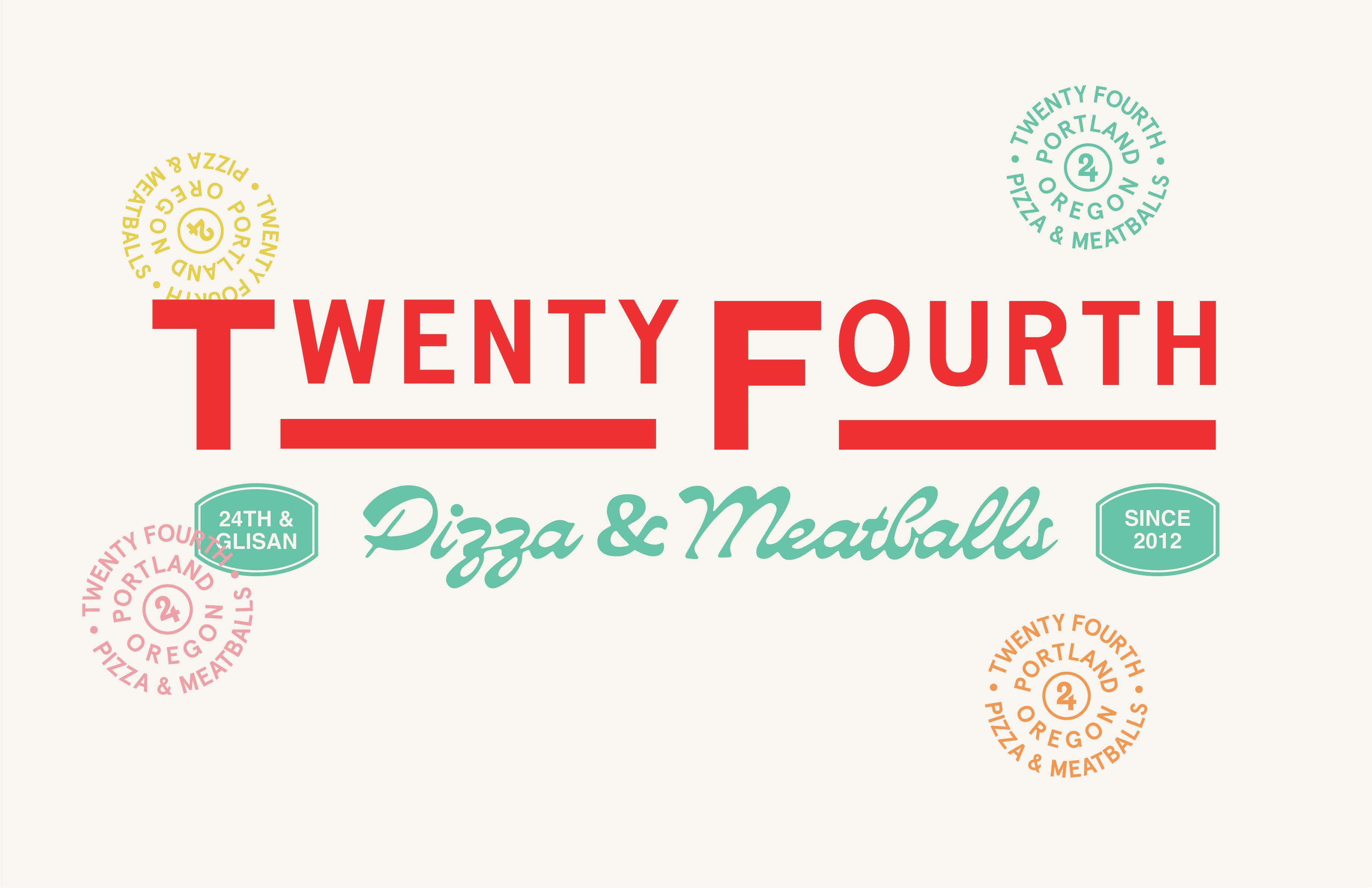
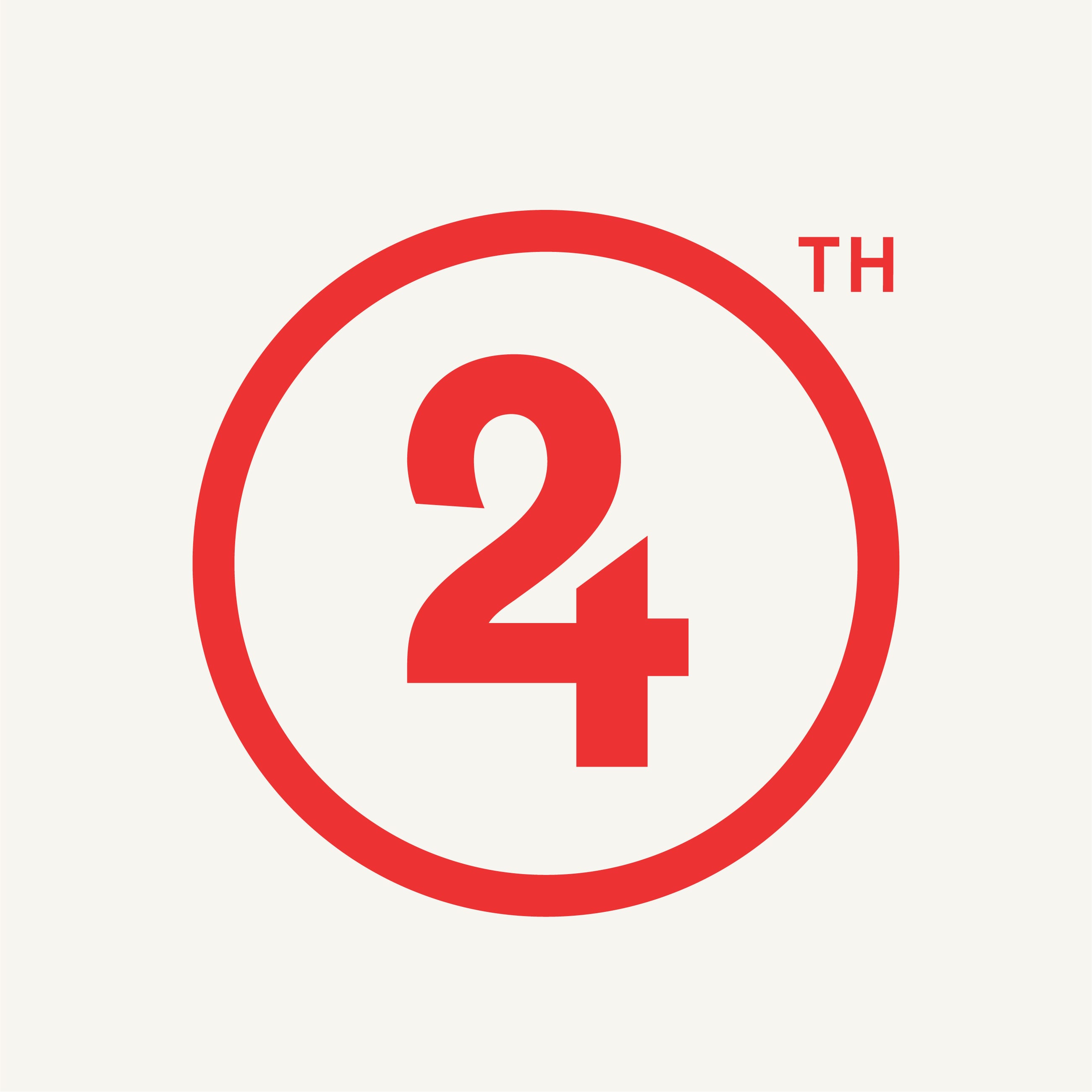
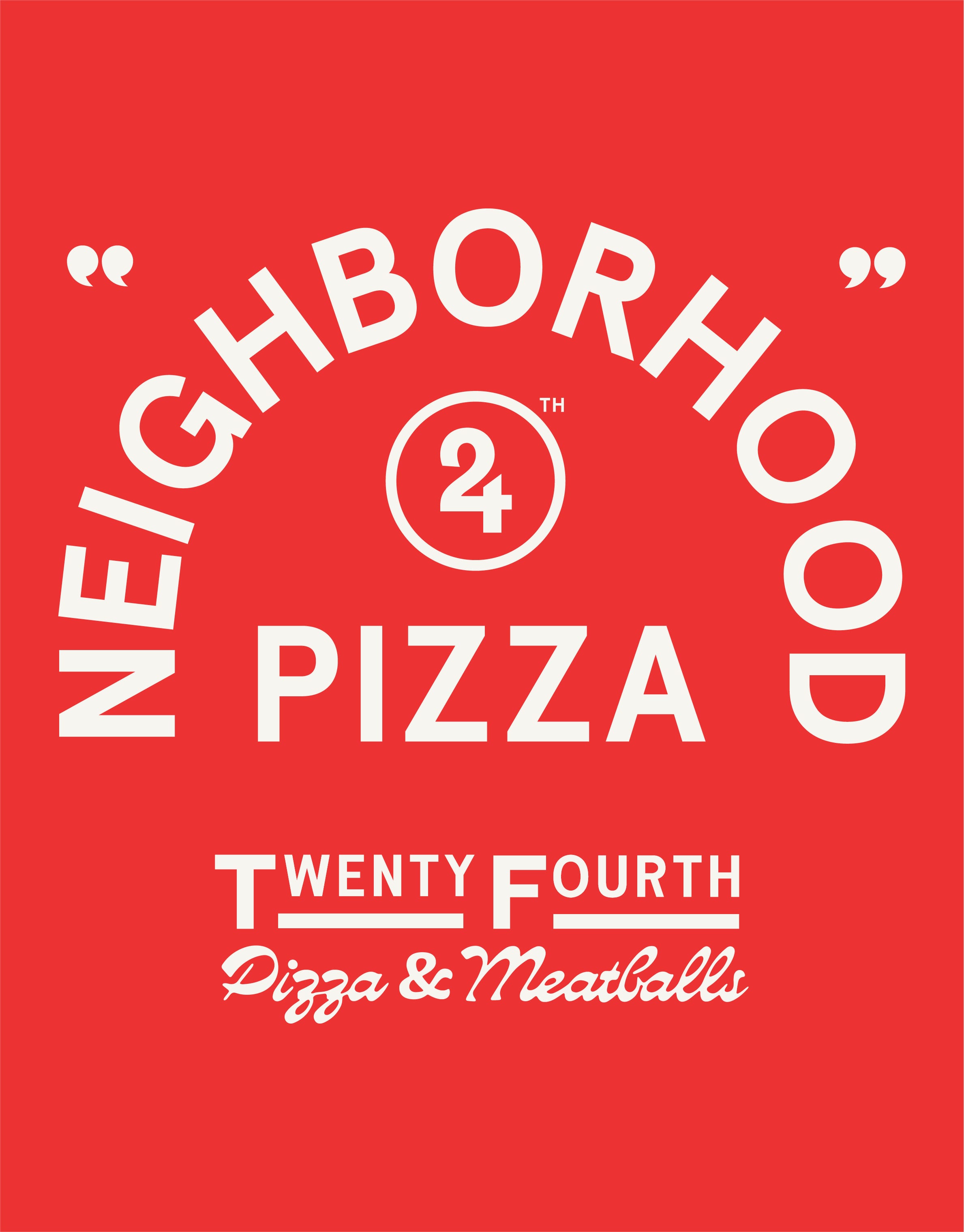
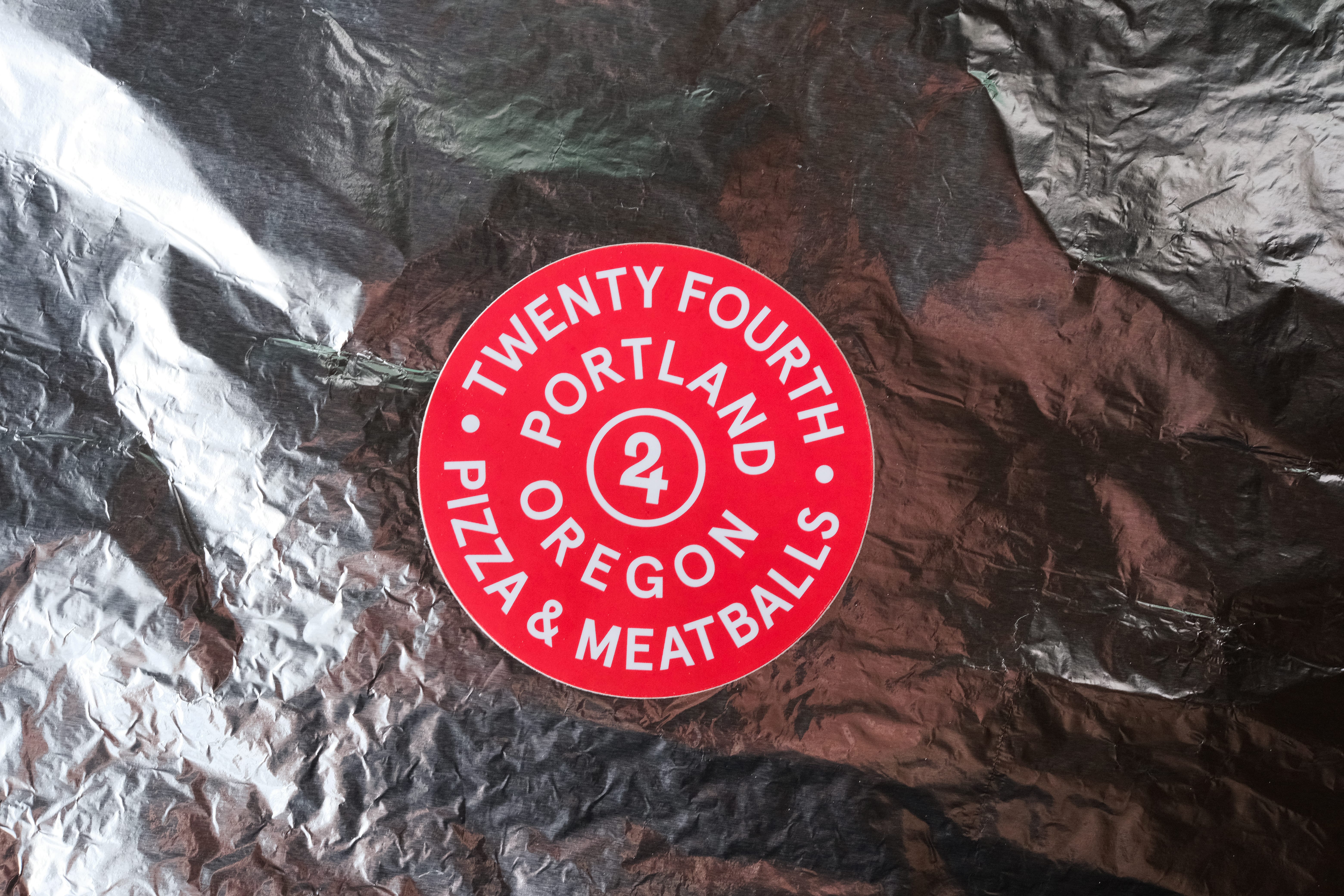
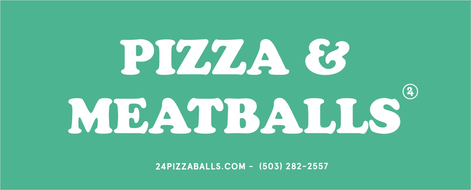
The 24th Pizza & Meatballs logo system simplifies the long name into an iconic “24” mark while keeping a wordmark version for clarity. Both versions carry a sense of history, with secondary stamps and classic lockups designed to look like they’ve been part of the neighborhood for decades. The color palette and typography channel New York corner slice shops, nostalgic but with a playful edge.
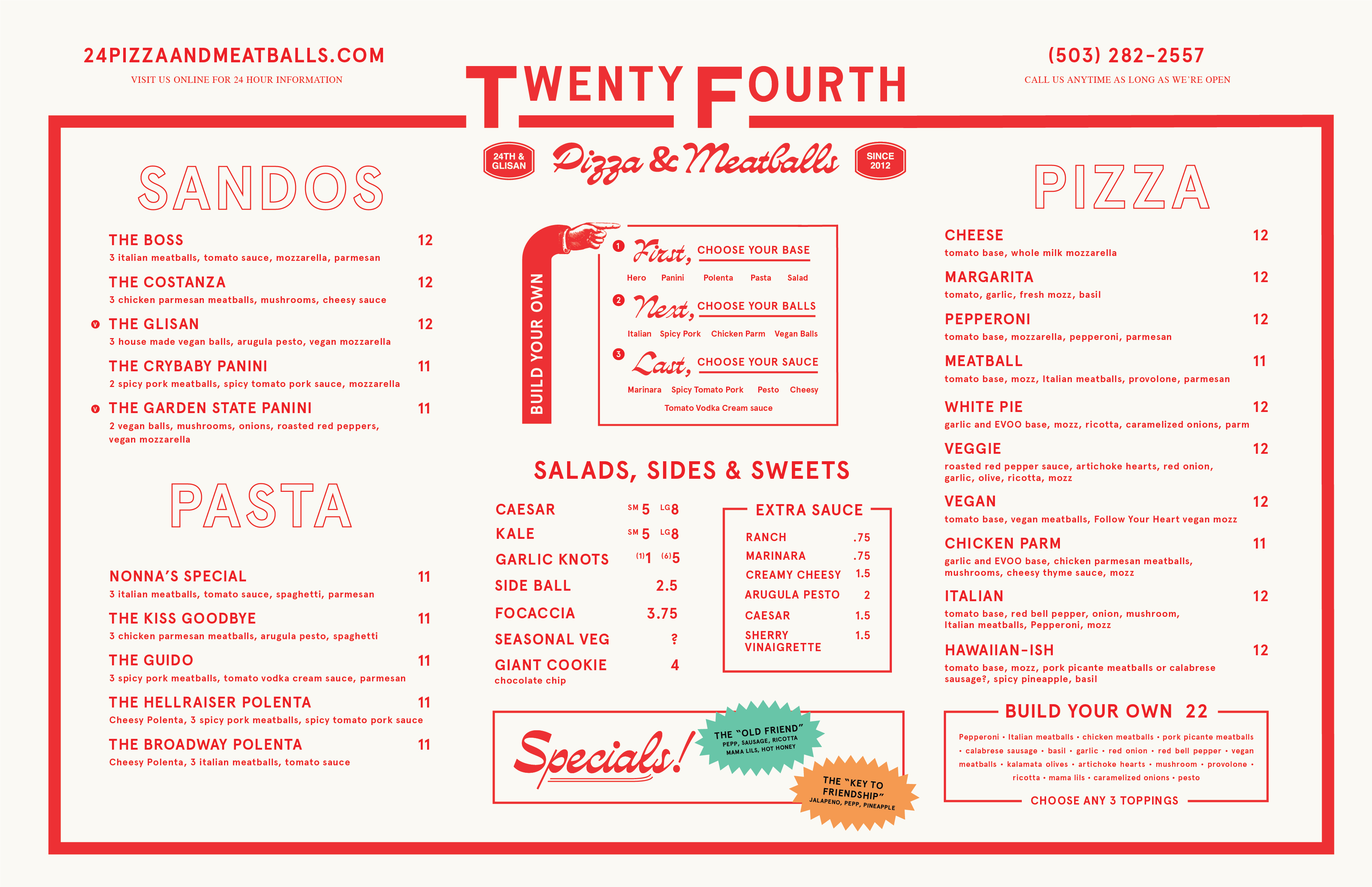
Menu
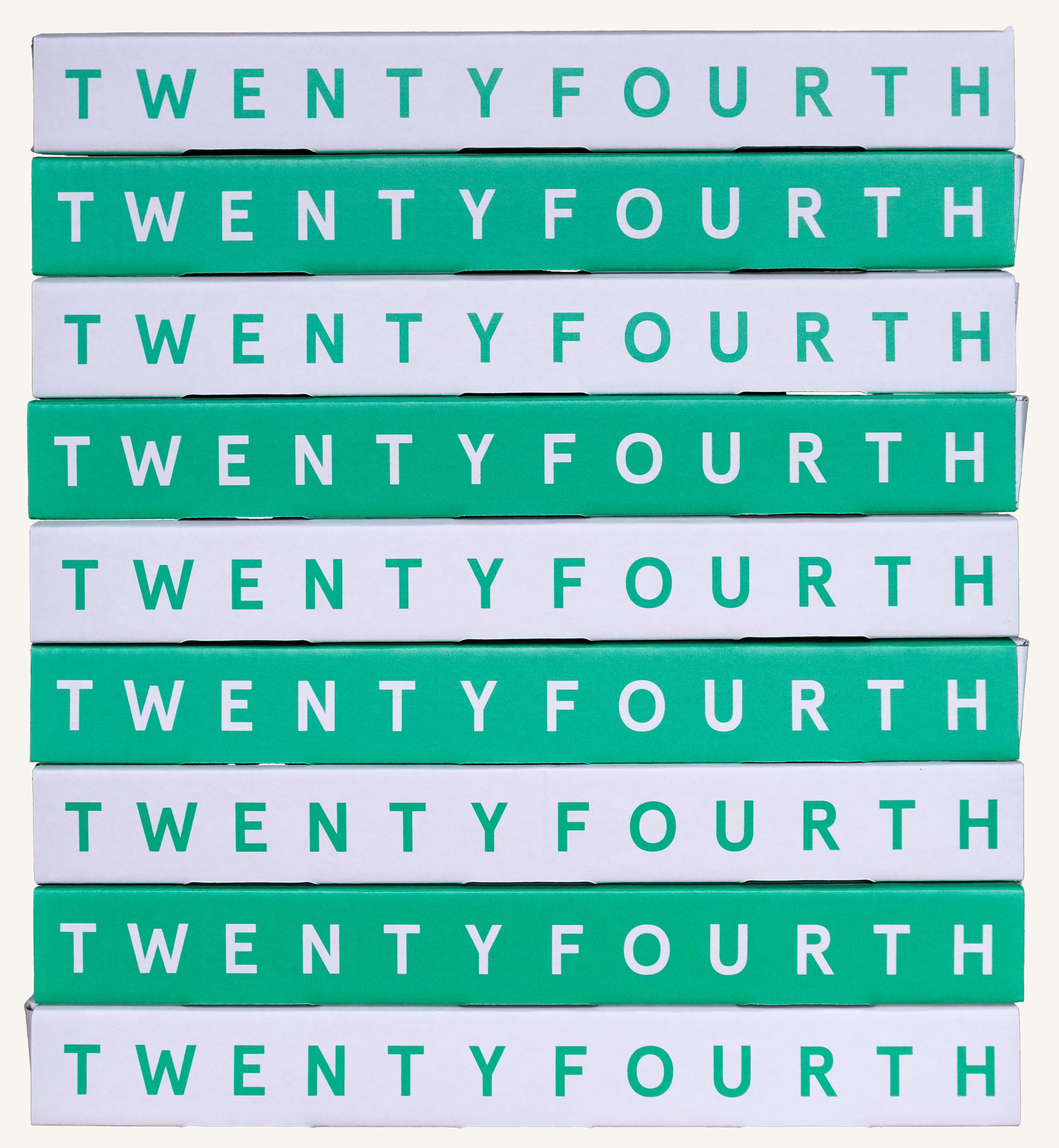
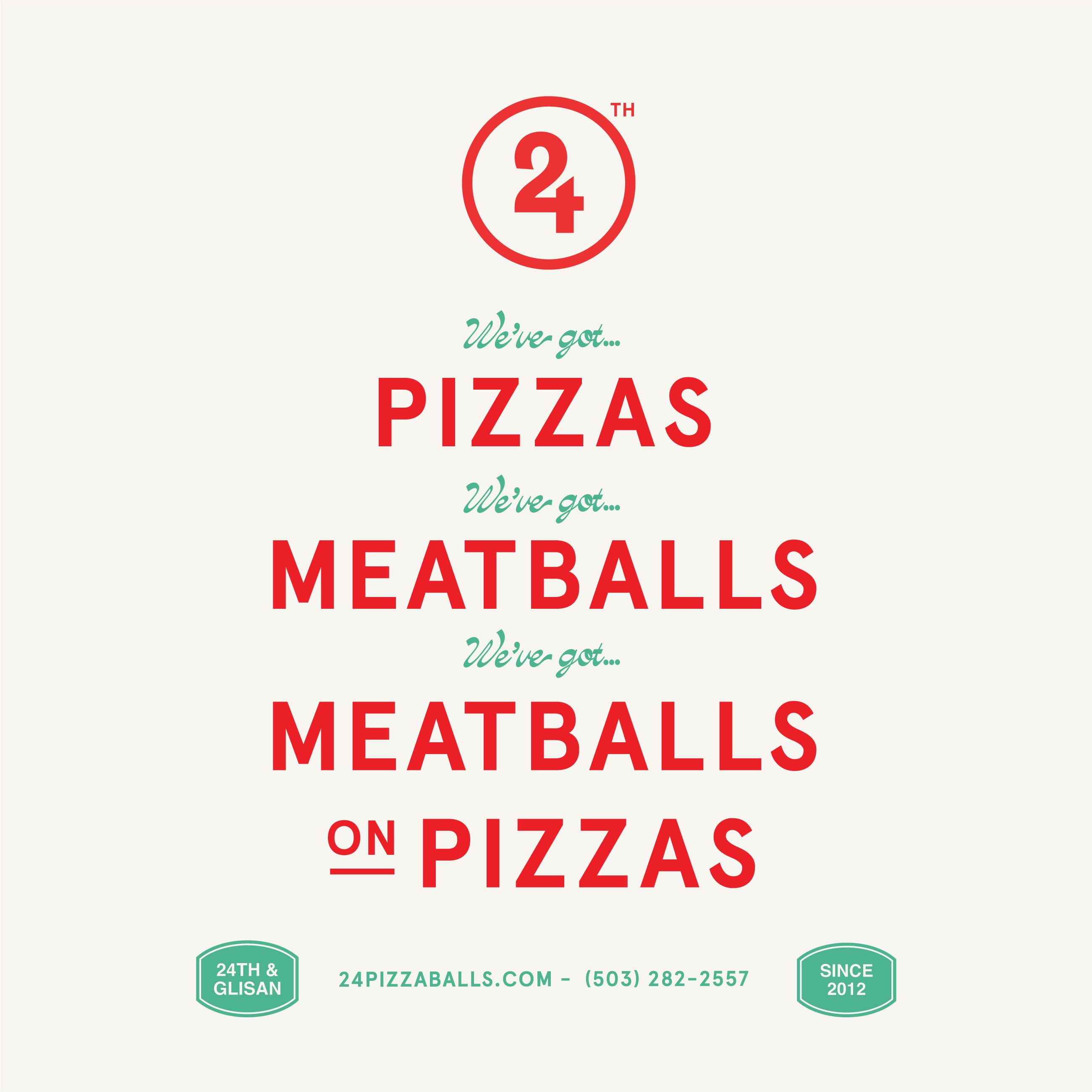
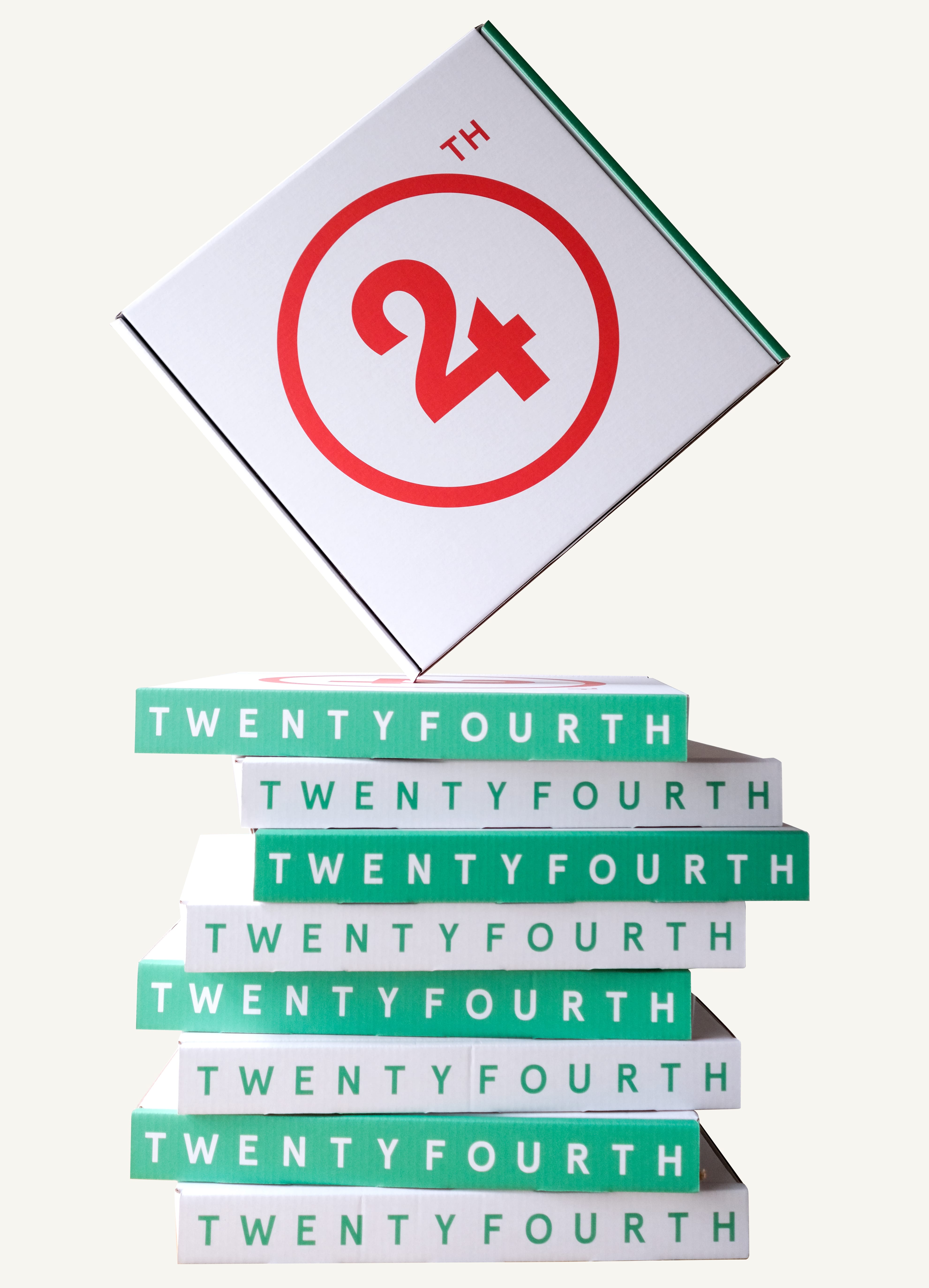
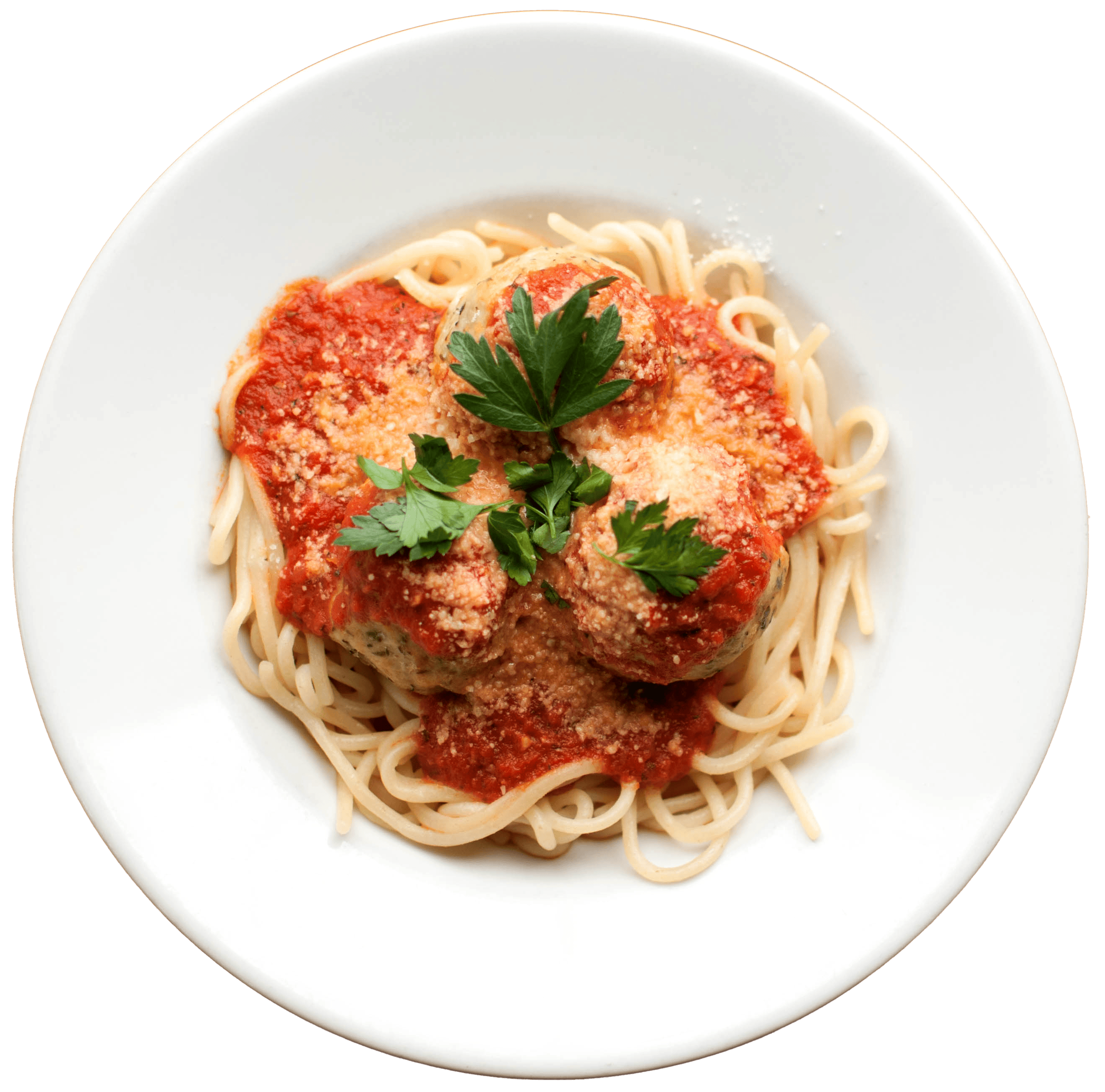
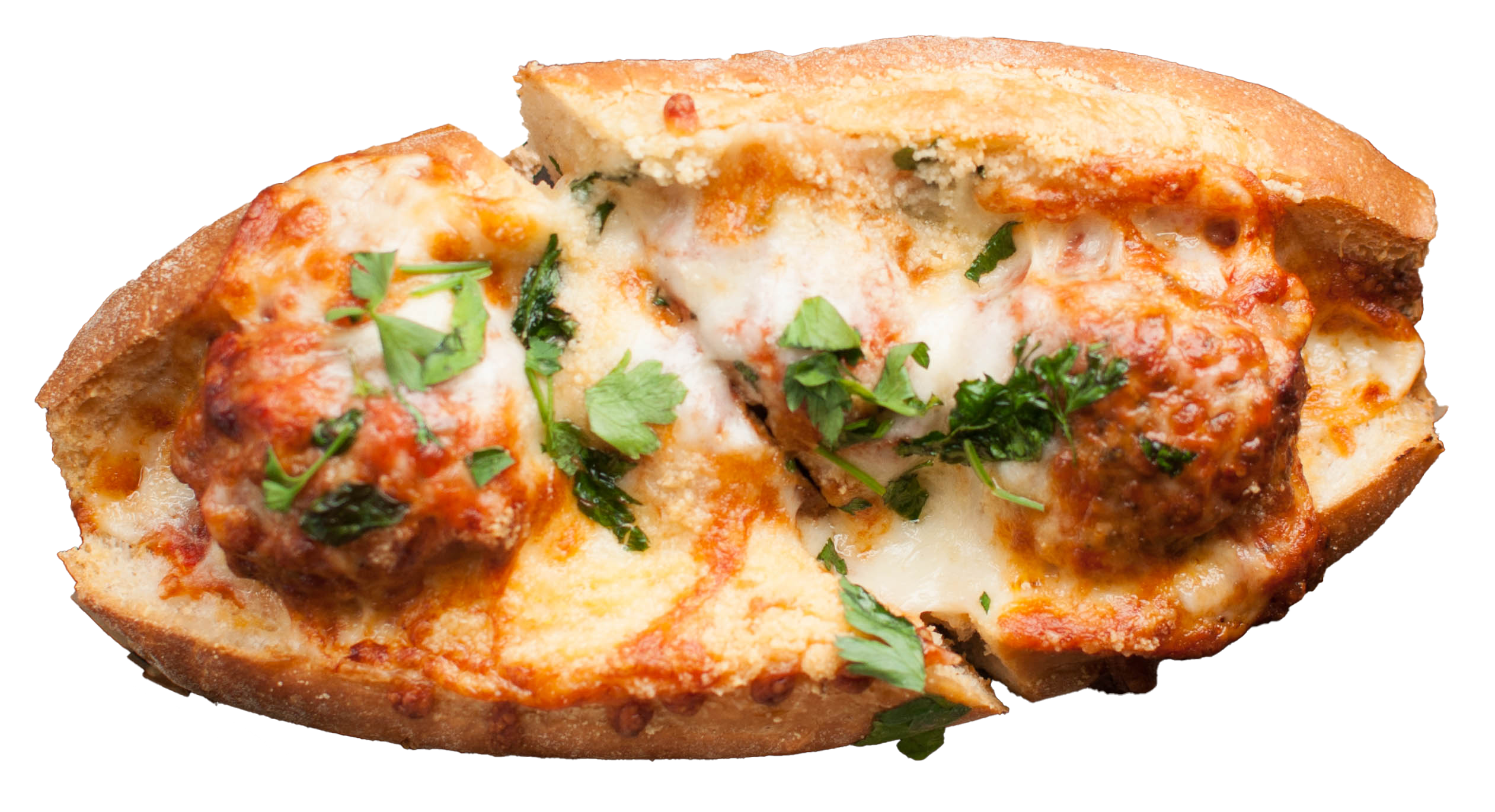
We coined “neighborhood-style pizza” to define their offering and set the tone with punchy taglines like "we’ve got pizzas, we’ve got meatballs, we’ve got meatballs on pizzas." Menu boards and packaging are designed for quick reads and big impact, using floating cut-out food images as graphic elements.
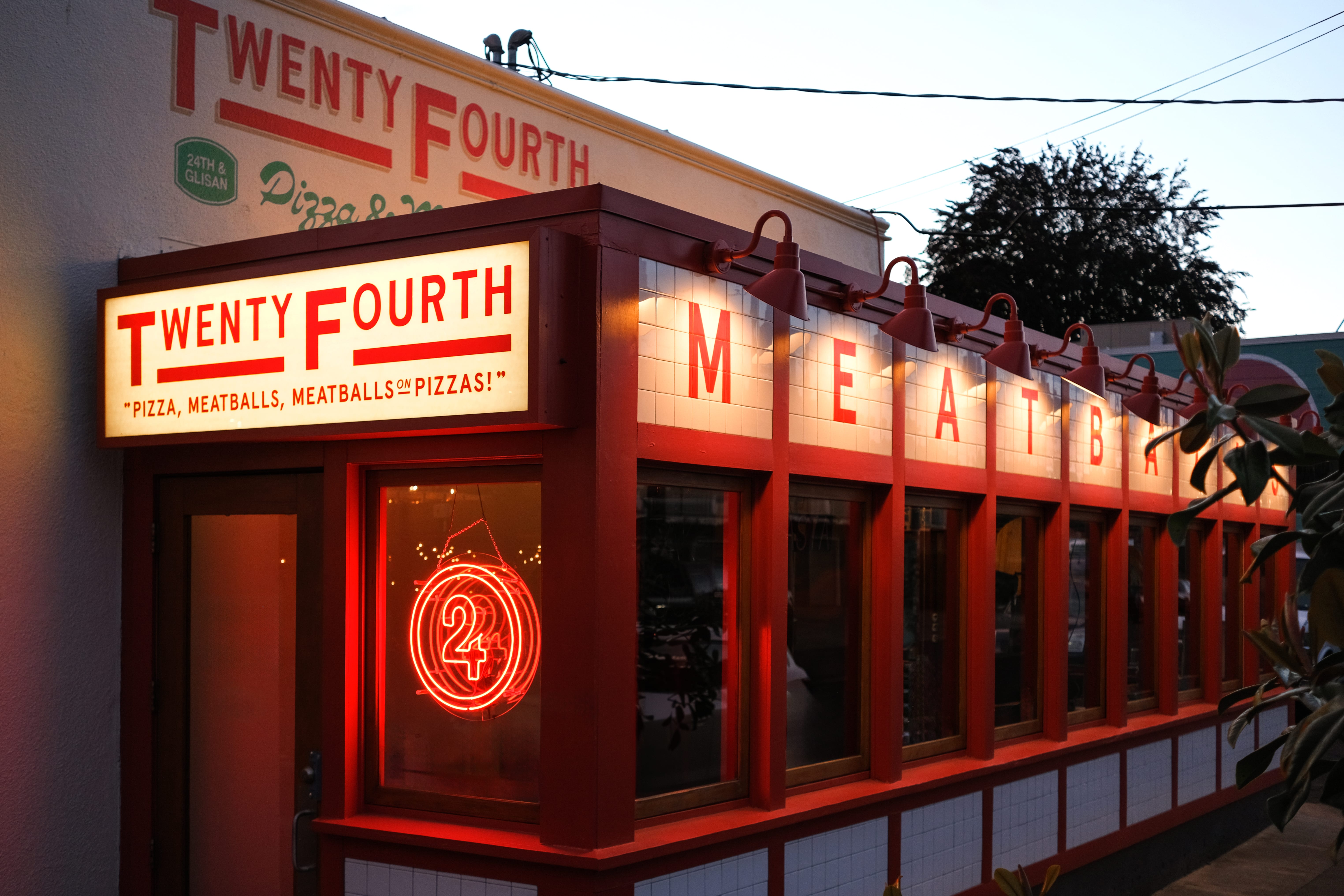
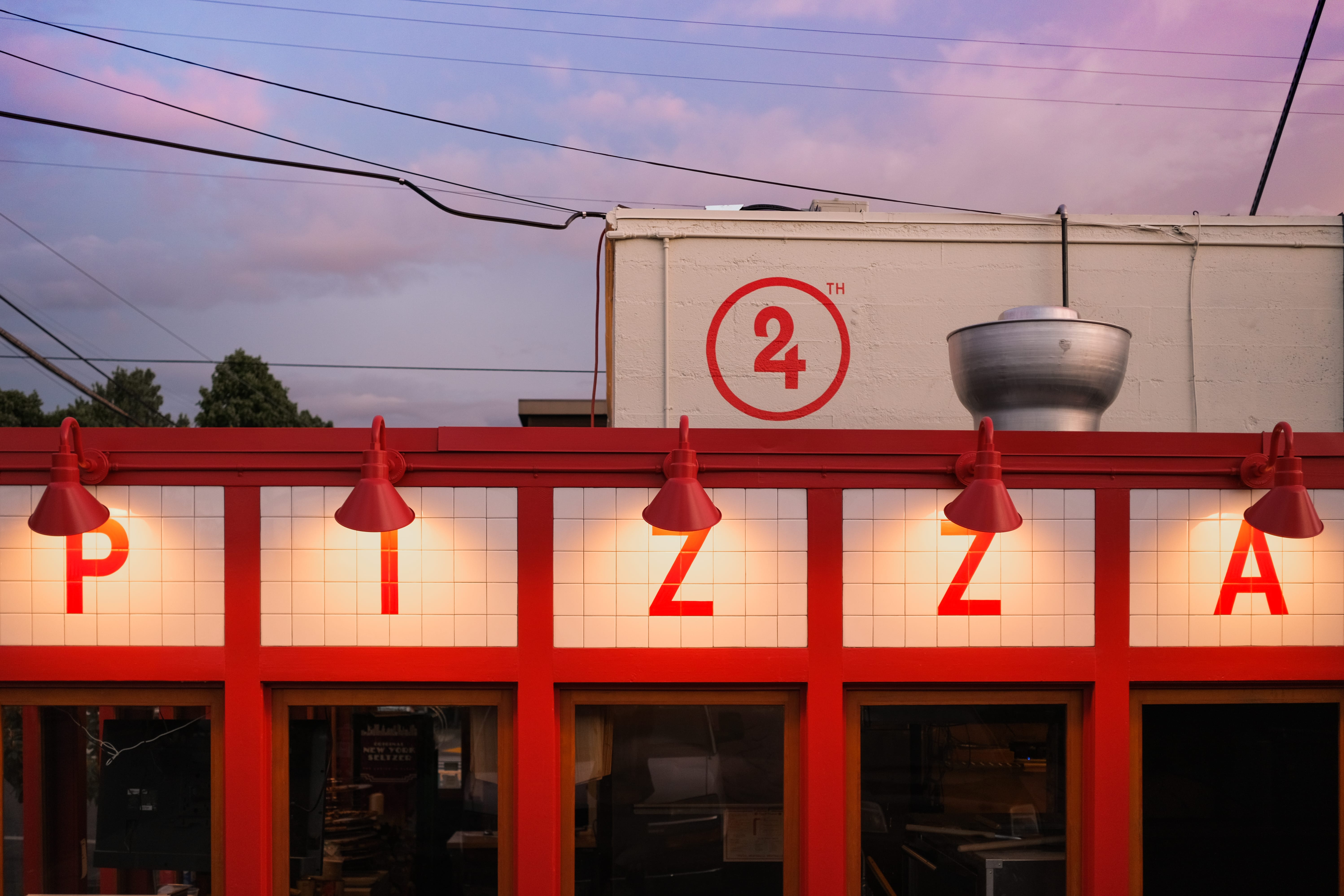
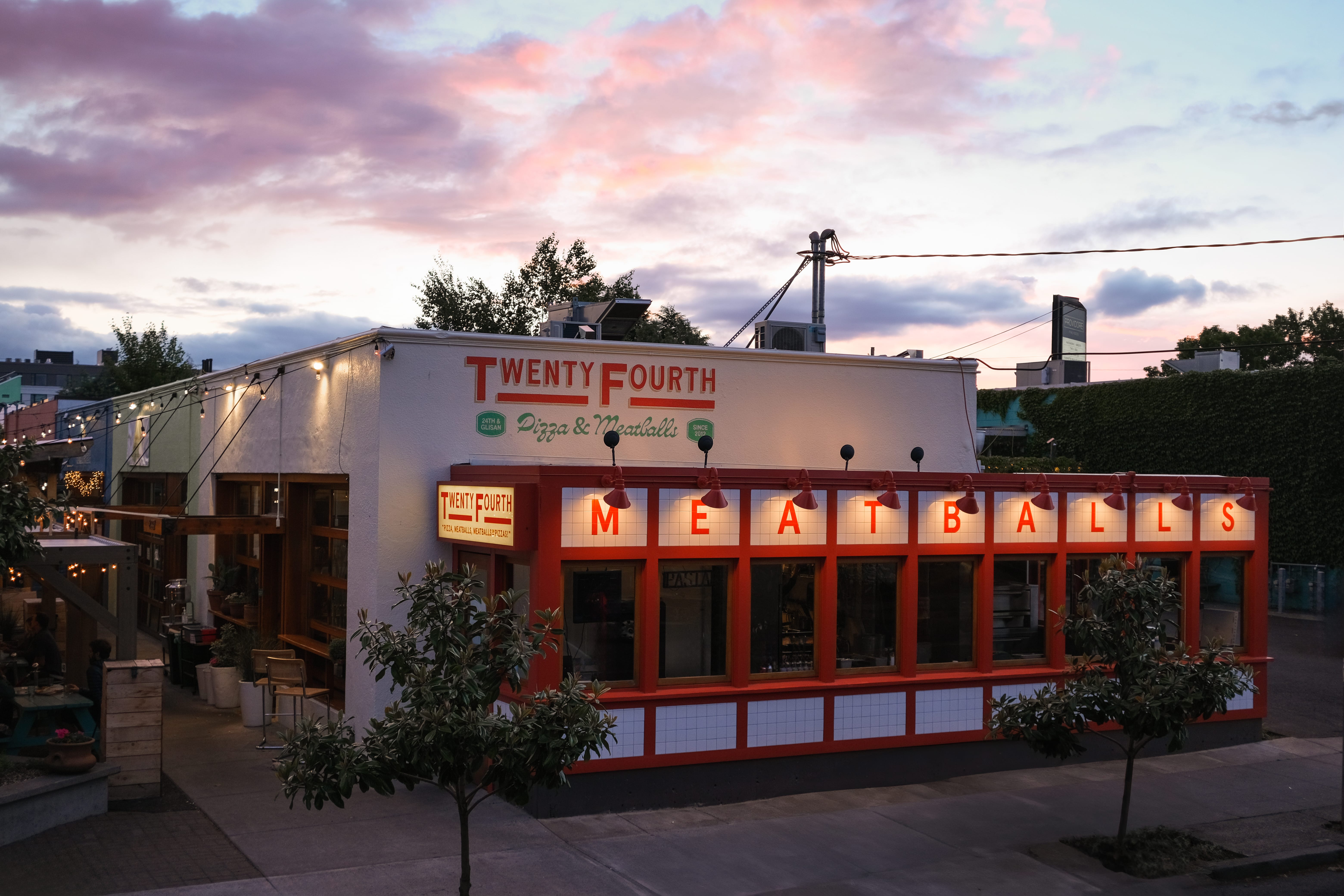
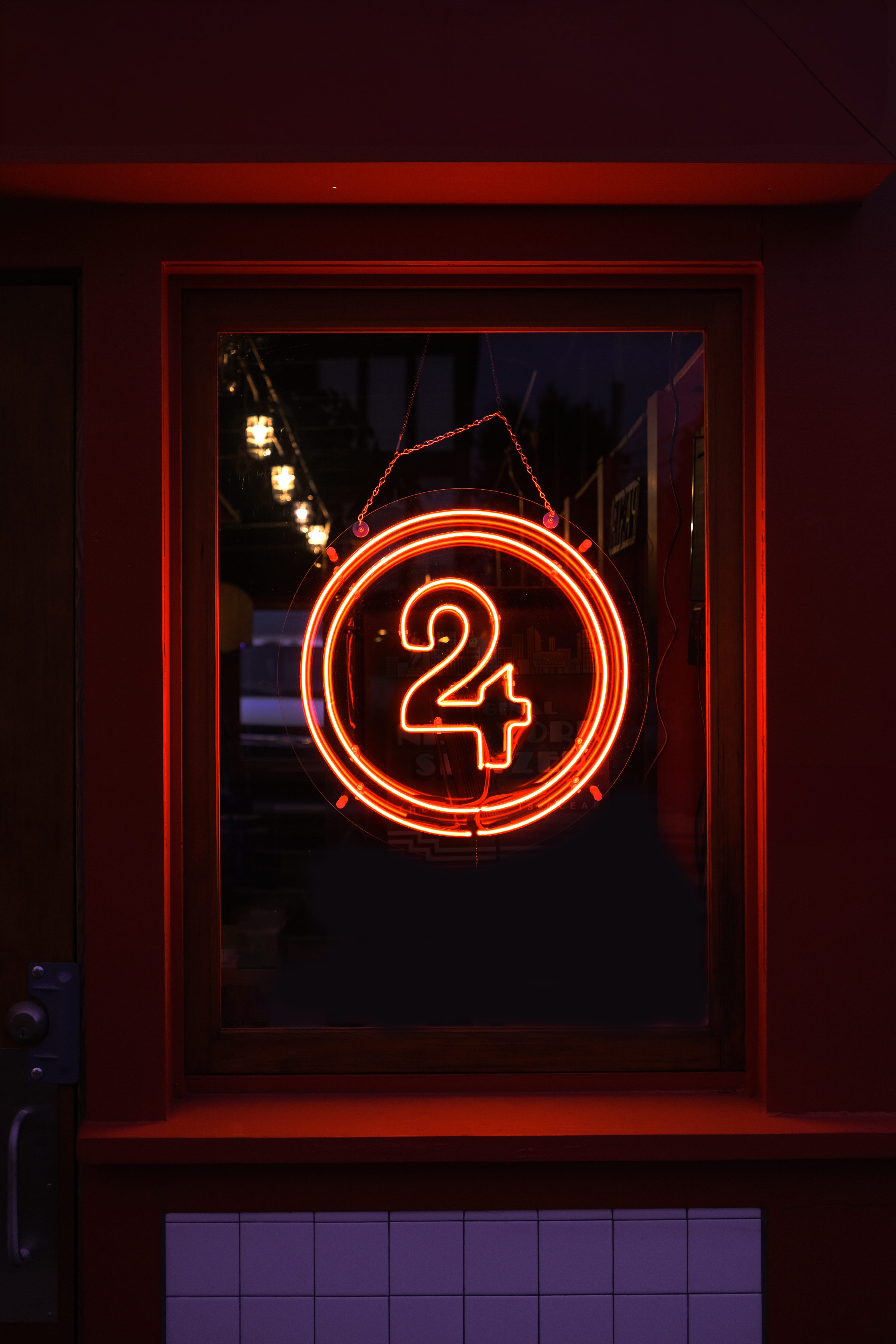
Exterior
Our work extended to exterior signage with a large light box over the door and hand painted signs up above. The result is a storefront that pulls people in with vintage-inspired lamp shades and a bright welcoming glow.